HubSpot’s reporting is excellent at showing you funnel conversion rate by stage, but one thing it lacks is an easy way to calculate funnel velocity - that is, how long it takes for an account or contact to move from one stage of a conversion funnel to another. This data can be invaluable for forecasting, as combined with your ASP metrics and funnel conversion rates it can give you a solid look at when you should expect to realize the revenue you have in the pipeline - trailing data can be leveraged in this way to provide a calculated expected close date, allowing you to forecast expected revenue times likelihood of close on a specific timeframe.
In this tutorial, I'll walk you through one way to create a dynamic funnel velocity report using HubSpot data, ingested into Google Sheets via Demand Sage. We'll go through:
- Connecting live HubSpot data to Google Sheets for manipulation
- Finding the calculated metrics to define your funnel stage dates
- Creating a chart with account-level funnel stage start dates
- Finding fast/slow moving accounts based on an average
- Extrapolating out likely close dates based on an account's velocity so far
Connecting Live HubSpot Data to Google Sheets
Demand Sage offers you this functionality, free of charge. Data updates nightly and any reports and calculations you create in the spreadsheet remains in place, so your insights are always available in their final form with up-to-date data.
Identifying Account-Level Funnel Stage Dates
In putting together a funnel, I used some typical HubSpot data points as the stages:
- Lead
- MQL
- SQL
- Opportunity
- Closed/Won
Now, all of these live at the Contacts level in HubSpot under the Lifecycle Stage object. However, when forecasting revenue, you’re not forecasting an individual moving down the funnel, but rather an account or organization.
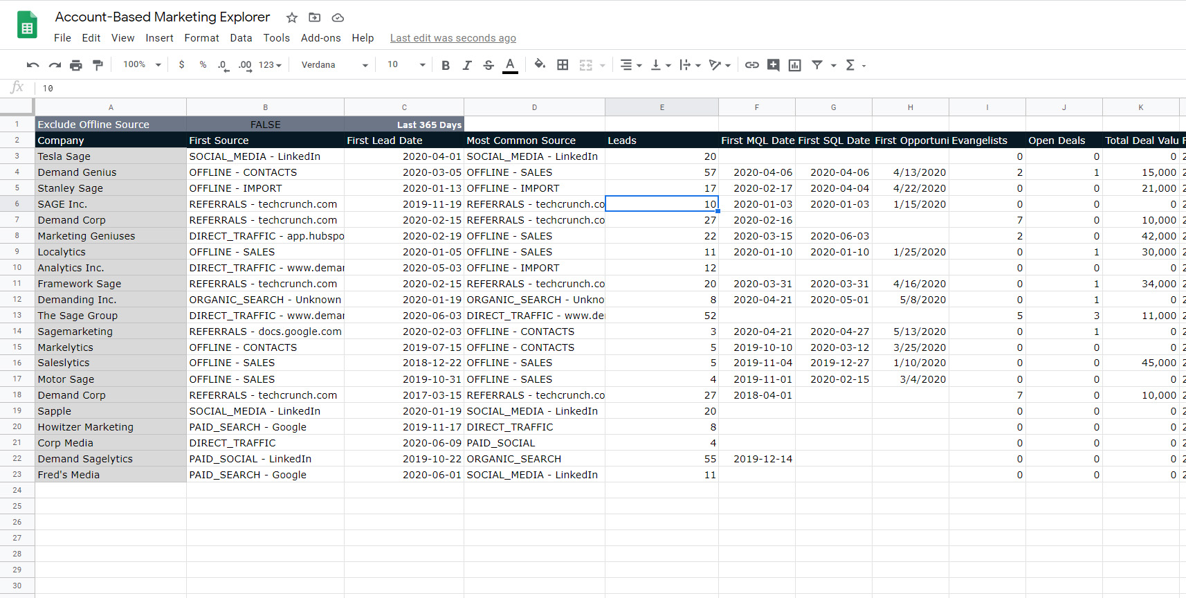
But by leveraging one of Demand Sage’s pre-built reports - the Account-Based Marketing Explorer - I can look at Contact-level data calculated to be relevant at the Company level. The ABM Explorer rolls up Contact-level data to provide calculated metrics, including first lead date, first MQL date, first SQL date and so on.
For the purposes of this tutorial, I am going to define my funnel as the first time anyone at an account became a lead, the first time anyone at an account became marketing qualified, sales qualified, had an opportunity or deal opened, and then the first time a closed/won deal was reached.

Calculate and Visualize Funnel Velocity
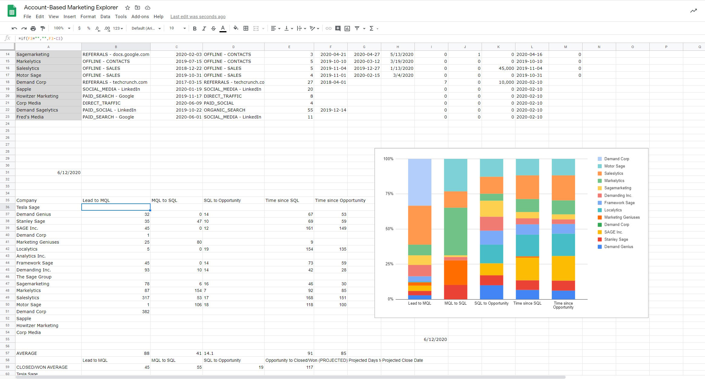
Now that I have my base data ready, it's time to manipulate it to answer my specific business question. By creating a second, quick section with all of the above account names and the time between each stage we have defined (if the account has moved to that stage; otherwise, the cell remains blank), I now have a table with the number of days it took each account to get through each step of the funnel.
For visualization, a 100% stacked bar chart with stages on the X-axis gives an easy-to-interpret look at how the accounts compare to each other.

Finding Fast- and Slow-Moving Accounts
Knowing how long an account takes to get through a particular stage is nice, but we need to contextualize that: is 32 days fast? Slow? Should we be concerned about an account? Do we need to dedicate more resources or find another lead?
To do that, we build a look at the averages. In this example, I've averaged out the velocity by stage for all of the accounts listed. You can also, if you prefer, use historical data on closed/won deals.
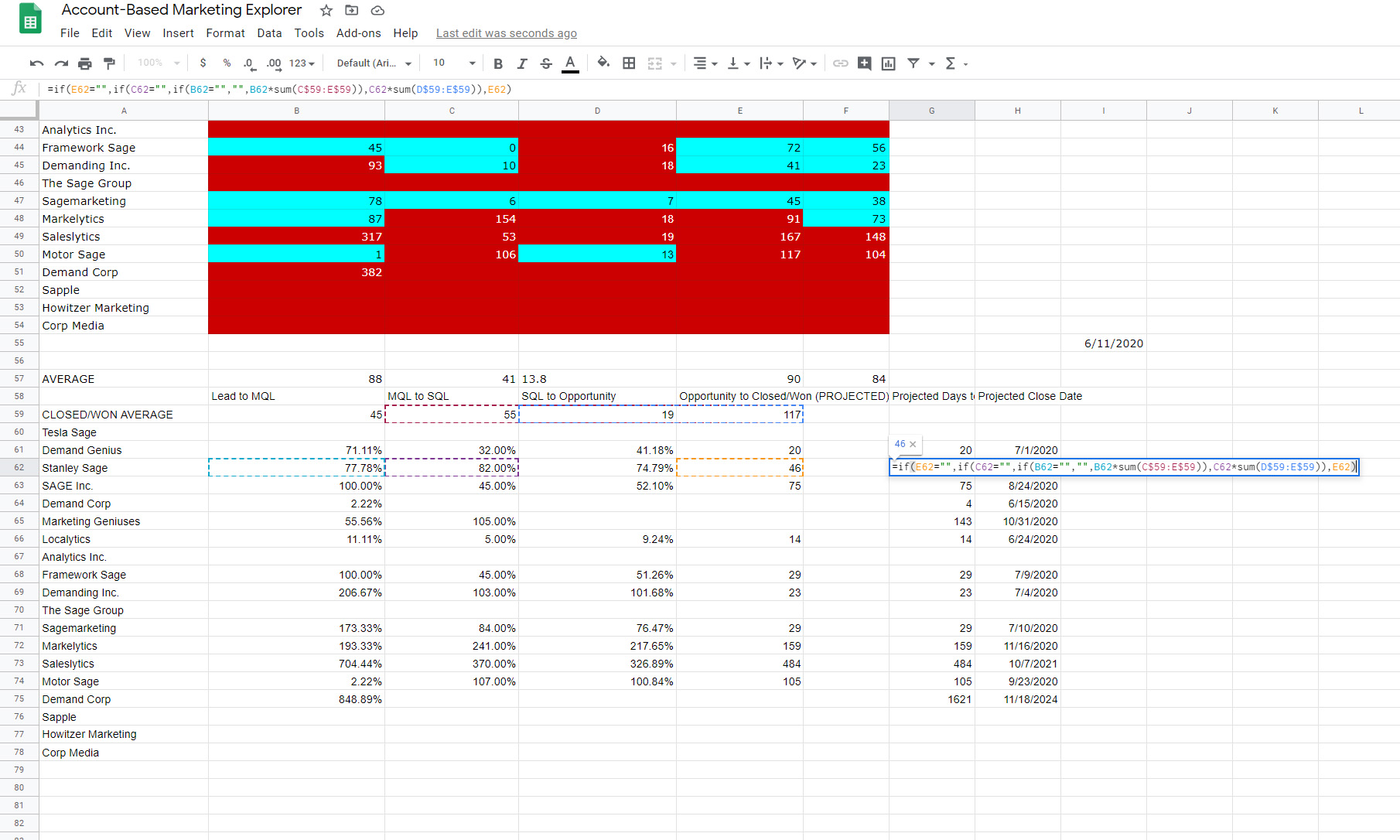
Now with a little bit of conditional formatting, we can see in bright colors any dangerously slow-moving or impressively fast-moving accounts.
(Yes, the colors are garish, but they get the point across)
Extrapolate Likely Close Dates
Here's where the forecasting value comes in: OK, an account is moving fast/slow, but when should I expect it to actually close?
By seeing how long vs. the average it's taken an account to get to its current funnel stage, you can simply apply that as a percentage to your average time in the subsequent stages.
For this look, I've created a row that represents the average time taken in each funnel stage for historical closed/won deals. Multiply an account's funnel velocity vs. the historical average to date by the expected time taken by the average closed/won deal to get through all remaining stages. This should give you a metric of projected days to close. Add a simple =TODAY() cell, add a column that adds the =TODAY() cell to the projected days to close, and voila - you have a list of calculated expected close dates
It takes a little spreadsheet finagling, but it works, and once you have set the formulas, the report will update daily as the data in HubSpot changes:

If you wish, you can take this even further by applying your funnel conversion rates to have a combined likelihood of close and expected close date report. This emphasizes the value Demand Sage offers - calculated metrics available out of the box in reports, the functionality of Google Sheets allowing you to create intricate calculations, and the back-end data updating from HubSpot to Sheets on a nightly basis. And, if the funnel defined in this writeup isn’t relevant to you, not a problem - pull in whatever datetime metrics apply to your company’s funnel and build it with them.
If you are not already using Demand Sage, try us out - the tool is free to use, and we are continually creating new reports for our Report Library based on user feedback and needs.
Check out this video of the Account Based Marketing Explorer in action, being used in part to create funnel velocity views:

